Every personal project I’ve built has eventually hit the same wall: I need a button, I need a modal, I need a sidebar — and I’m either copying components from a previous project, installing a third-party library that doesn’t quite fit, or starting from scratch and making slightly different decisions each time.
That inconsistency bothered me more than I admitted for a while. Each project looked a little different. The colors were close but not the same. The components behaved slightly differently. Nothing was broken, but nothing felt cohesive either.
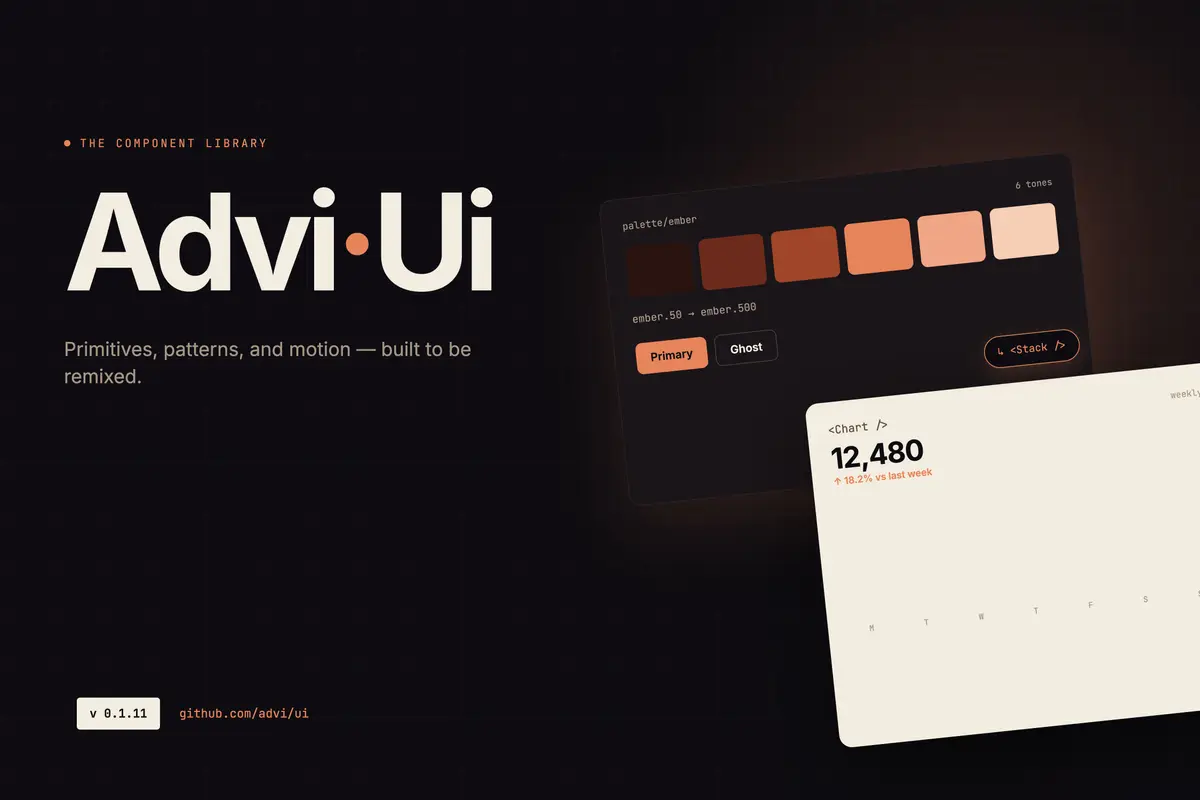
advi-ui started as the answer to that problem.
Where This Started
Before working on my own projects, I spent time as a frontend developer at Google. One of the things you get used to quickly there is working with a mature internal component library — internally called Glue. Everything you need is already built, already accessible, already consistent. You pull in a component, pass your props, and move on. You don’t think about the button. You think about the product.
Coming from that environment and moving into personal projects was a jarring shift. Suddenly I was writing CSS for a button. Then writing it again for the next project. Then again for the one after that. Each time making slightly different decisions — different border radius, different hover state, different spacing — because there was no shared reference to defer to.
The problem wasn’t that the buttons were bad. The problem was that I was spending time on a problem I’d already solved, over and over, with no compounding benefit.
The Real Reason
The honest reason I built a component library isn’t just a productivity one. It’s also about identity.
I have a specific visual language I keep returning to across everything I build: deep teal backgrounds, warm orange accents, a typographic stack that feels editorial without being precious. That aesthetic isn’t something I invented rationally — it’s just what I’m drawn to, and over time it’s become a signature of sorts across my personal work.
Using shadcn or MUI means layering my preferences on top of someone else’s opinions. That’s fine for production projects where correctness matters more than identity. But for personal work — the projects that are supposed to represent me — I wanted something that started from my aesthetic rather than adapting toward it.
Building a library forced me to make those decisions once, clearly, and then not revisit them every time I started something new.
The Problem with Copying
Before advi-ui, my approach to shared components was copy-paste. Build something in one project, copy it to the next when I needed it, adjust as required.
That sounds workable until you live it. You copy a card component into three projects. Then you improve the card in one. Now you have three versions, diverging quietly. You fix a bug in one and forget the others have the same bug. You update the styling in two but miss the third. None of it is catastrophic, but all of it is waste — time spent managing inconsistency instead of building things.
What I really needed was what I’d had at Google: one canonical definition of a component, shared across everything, updated in one place.
Consistency Across All Projects
advi-ui solves a much smaller problem than an enterprise design system, but it solves it fully: me, building multiple personal and frontend projects, wanting them to feel like they came from the same person.
The color tokens live in one place. The font stack is defined once. A Button is a Button — it behaves the same in every project that installs the package. When I update a component, every project gets the update. When I notice an inconsistency, I fix it once.
That’s the whole value proposition at this scale. And it turns out to be worth quite a lot in terms of focus. If I’m starting a new project, I’m not making UI decisions. I’m making product decisions. The components are already there. I install the package, import what I need, and move on to the actual problem.
The Stack Decision
When I decided to build it, the choices were React and TypeScript — that part was easy, it’s what I build everything in. The rest took more thought.
I knew I wanted SCSS for the token layer and Tailwind for utilities inside components. I’d used both separately and they solve different problems — SCSS for structured, cascading design tokens; Tailwind for the rapid layout and spacing work you’d otherwise write by hand. Using them together made sense.
shadcn was on the table. I looked at it seriously. The copy-paste model is clever and I like that you own the code. But adopting shadcn means starting from its visual opinions and overriding toward mine, and at some point that’s more work than starting fresh with the aesthetic I actually want.
MUI was the other obvious reference point. Working with Google’s internal library gave me a clear picture of what a mature, comprehensive component system looks like. MUI is that at open-source scale — exhaustive, highly capable, built for teams maintaining large products. I wasn’t trying to build that. I didn’t want to build that. The ambition was narrower by design: build what I actually need for my own projects, build it well, and stop there. Not a framework. Not a design system for teams. Just the components I reach for every time I start something new.
That constraint — build only what’s necessary — turned out to be the right one. It kept the library focused and kept me from over-engineering something nobody asked for.
Owning the Tool
There’s something that changes when you build a tool versus consume one. When you use someone else’s component library, you eventually hit its edges. You want a prop it doesn’t expose. You need behavior it doesn’t support. You file a GitHub issue and wait, or you fork it, or you wrap it in something that fights the original design.
When you built the thing yourself, there are no edges in that sense. Every constraint is one you put there, and you can move it. That’s not an argument for building everything from scratch — it’s an argument that for foundational tools that sit at the center of your work, ownership matters.
A component library is as foundational as it gets. It touches every project. Owning it means I can make it exactly what I need, change it when my needs change, and not be blocked by someone else’s roadmap.
It’s a Living Thing
advi-ui isn’t done, and it’s not meant to be. It keeps growing as I build more things and run into new gaps. A component I build for one project gets generalized and pulled into the library. A rough edge gets smoothed out. Something I built early without thinking carefully enough gets redesigned.
The goal has always been to make advi-ui useful across as many of my frontend projects as possible — not a one-time effort but an ongoing investment that pays back more over time. More components, more themes, more flexibility. Every release makes the starting point for the next project a little better.
The Storybook is live at advi-ui.vercel.app and the library is on npm. If you’re building multiple personal projects and finding yourself rewriting the same UI pieces repeatedly, the fix might be simpler than you think — define your components once, publish them somewhere you can reach them, and stop making the same decisions twice.
The alternative is writing the button CSS for the fifth time. I’ve done that enough.